Azure Monitor Health Models
Redesigning how people read system health inside Microsoft Azure, so someone under pressure can see what is failing, when it changed, and what to fix first.
Jump to my work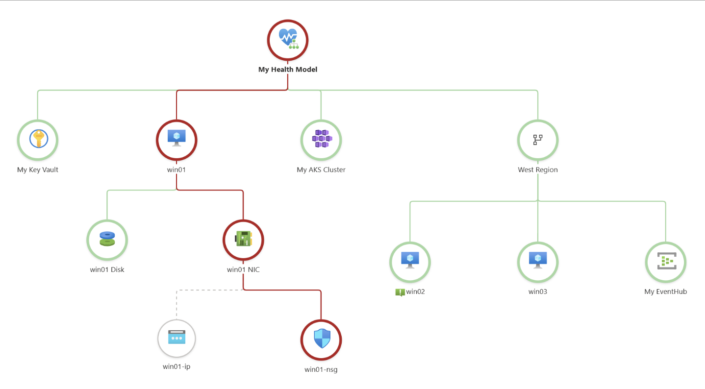
A health model. Every circle is a piece of a cloud system, colored by its state. When something breaks, engineers read this tree to find out where. Existing Azure interface shown for context.
Azure Health Models draws a cloud system as a tree of connected parts, each marked healthy, degraded, or unhealthy. People open it when something is already going wrong, and it was built for experts.
Our team of seven worked with two Microsoft engineers to make it clearer for both new and experienced users. I designed the Threshold Spectrum, a gauge that shows how close an entity is to failing. I also mapped and tested the Visibility of State designs.
How can we redesign Azure Monitor health models to enhance clarity and usability for both experienced and new users, without breaking what already works?
New users
Interns and early practitioners who need guidance and quick value.
Experienced users
Engineers and architects who need speed, control, and depth.
Our persona, Joel, is new to Azure. He knows the concepts but not the interface, and has to decide what to fix first.
What we worked within
- One semester limited how many ideas we could design.
- The platform is technical, and most of us had no technical background.
- Designs had to fit Azure's design system and be feasible for engineers to build.
Background
What is Azure Health Models, and why is it hard to use?
Read moreRead less
Azure Health Models lets teams track the condition of the resources behind an application. It offers a graph, a timeline, custom health signals, and alerts sent to the people who manage the system.
Our scope was configuration, visualization, and alerting. Early on we learned there is no single experience to design for. What a user sees depends on how the system is set up and how familiar they are with Azure, so we shifted from streamlining one path to supporting both experts and newcomers.
Every idea also had to fit Microsoft's design system and be realistic for Azure's engineers to build.
Research first, then ideas
Discover
Click a step to see what we did.
Microsoft's docs, community forums, and a walkthrough video of how Health Models works.
A tool built for experts. It offers a graph, a timeline, custom health signals, and alerts, but what a user sees depends on how the system is set up.
There is no single experience to design for, and we had to plan for both experts and newcomers.
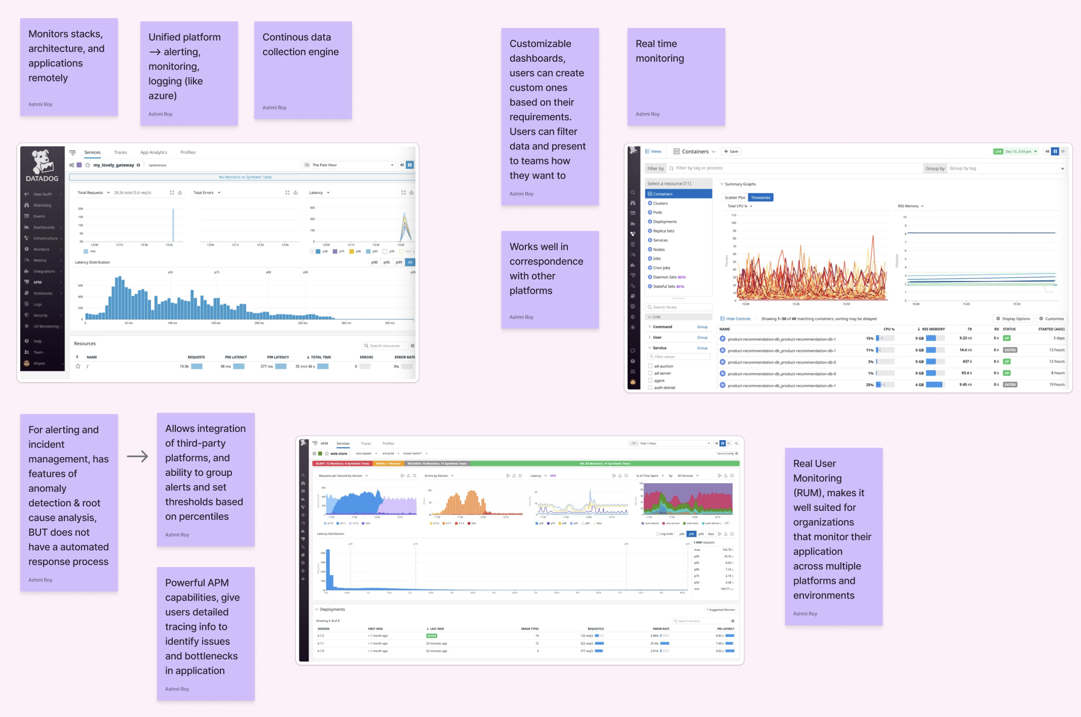
Azure with four rival monitoring tools, to see how each one shows system health.
The Datadog and IBM Instana analyses. I broke down each tool's features for the team's competitive analysis.
Instana lets users filter alerts by issue type to get to triage faster, but keeps alert history for only 7 days, compared with 30 in Azure. Its filters became a question we asked in our interviews.
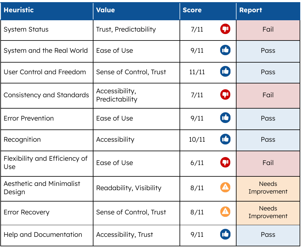
Azure Health Models against 10 usability heuristics.
3 fail, 2 need work, 5 pass.
System status, consistency and standards, and flexibility and efficiency.
The graph shows state mostly through color, which is hard to read at scale or with color blindness.
Something you would show in a marketing demo.Interview 2, on the graph's health colors
Alert fatigue, a steep learning curve, and colors that were hard to read without a legend.
2 user interviews in October 2025. One user learned the tool by trial and error, and said it is opened in times of distress, when there is no time to dig for answers.
I wrote the interview protocol and took part in the interviews.
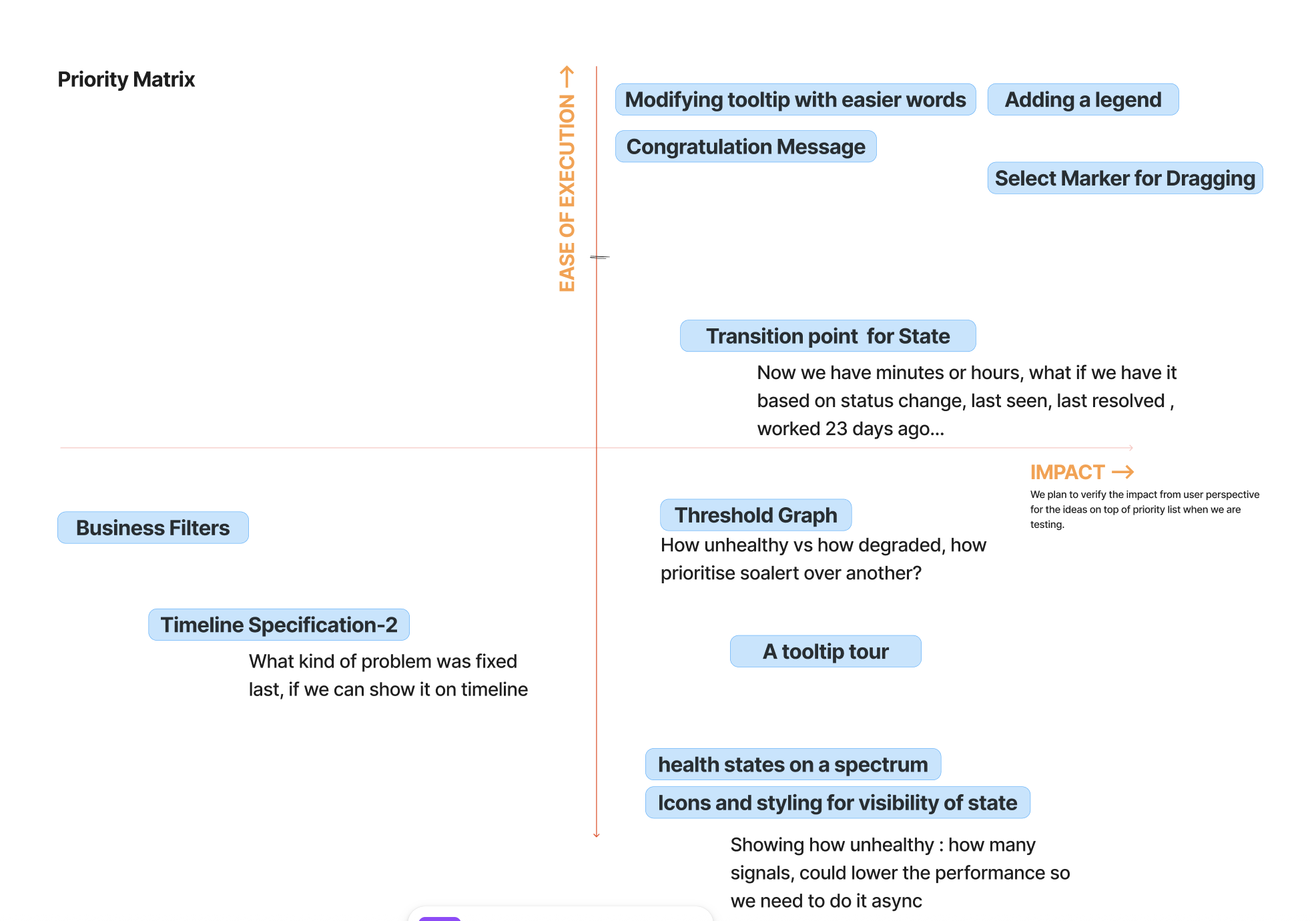
Ideas by ease of execution and impact, together with our Microsoft sponsors.
Four ideas moved forward.
We had one semester, and every idea had to fit Microsoft's design system and be realistic for Azure's engineers to build.
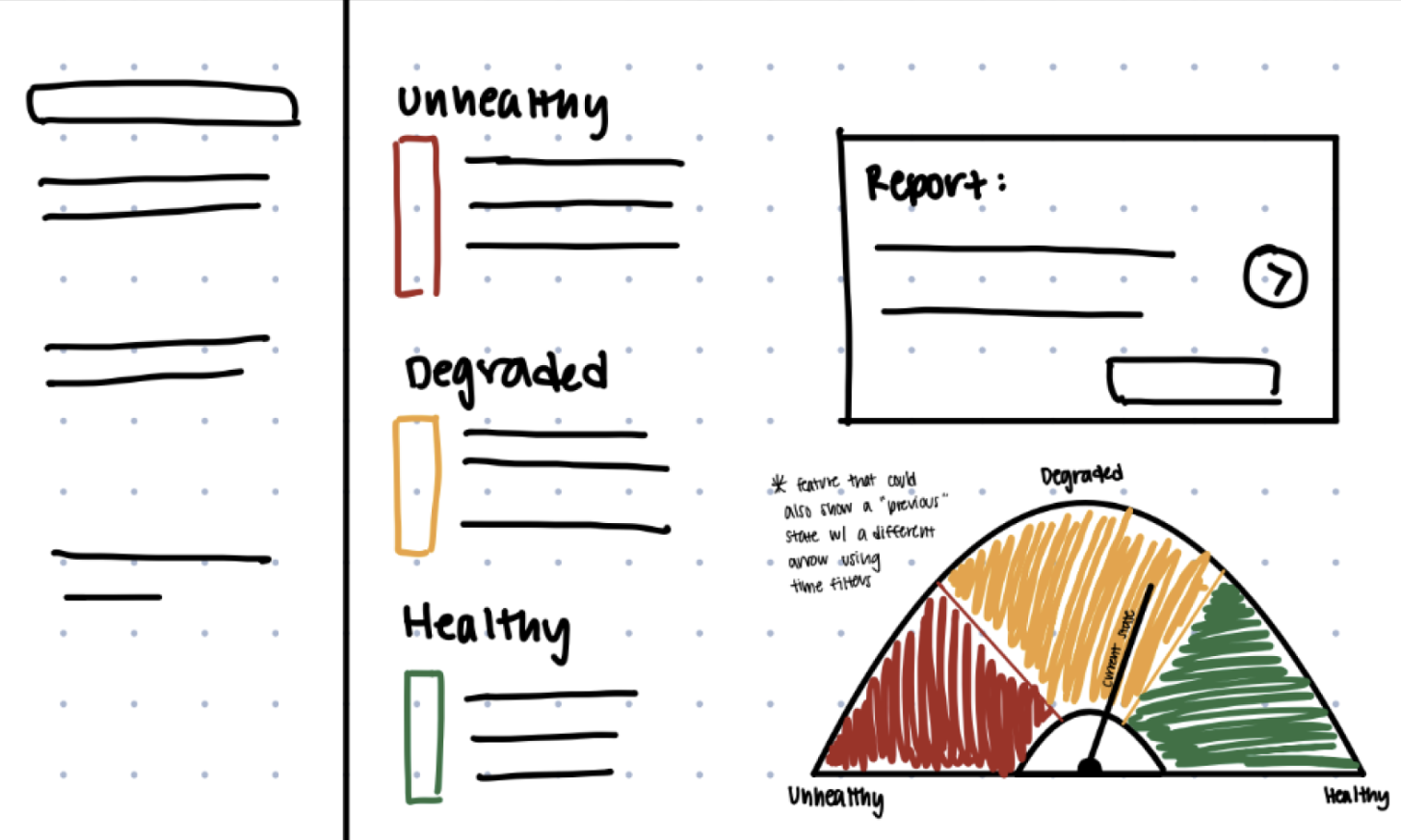
Solutions as a team, starting from the ideas that moved forward.
A gauge for how close an entity is to failing, with unhealthy, degraded, and healthy zones and a needle for the current state.
The Threshold Spectrum, shown below.
Beyond the Threshold Spectrum
- Analyzed Datadog and IBM Instana for the competitive analysis.
- Wrote the interview and testing protocols.
- Took part in interviews and ran usability tests.
- Mapped current and redesigned flows for Visibility of State.
- Presented and discussed work with Microsoft sponsors.
- Wrote the documentation pages for my activities.
Threshold Spectrum: how close is this to failing?
A degraded entity looks the same whether it just crossed the line or is minutes from failing. I designed a gauge that shows where an entity sits between healthy and unhealthy, so users can judge urgency at a glance.
How far are you from unhealthy, and how quickly are you approaching it?The question behind this feature, from our Interview 1 notes
The first idea was a gauge with unhealthy, degraded, and healthy zones and a needle for the current state. I also sketched a second arrow to show a previous state when a time filter is applied.
The goal was a visual aid that avoids dense numbers and timelines, driven by thresholds users already set.
I placed the gauge inside the existing Entity Details screen, using Microsoft's own layout and components.
A value label sits under the needle, so state is never communicated by color alone. A Health Score card breaks the number down by signal, showing what is pulling an entity toward failure.
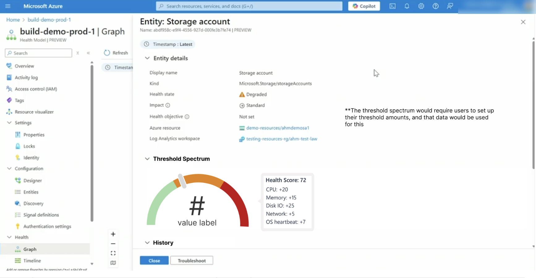
What testing changed
- The gauge started as a smooth gradient. I switched to clear color blocks, which are simpler and make the number easier to read.
- Later feedback confirmed it: users were unsure what "halfway to red" means on a gradient.
The open question
- Each entity has its own signals with different units. One scale has to be built from the most impactful ones.
- Thresholds would need to be set by users, and criticality also depends on context and rate of change.
- The team's handoff lists feasibility research as the next step.
Visibility of State: seeing the problem in a big tree
Health was shown mainly through color. One interviewee described 61 API and database calls just for a login page, which means 61 nodes to scan. Our team designed a way to focus on what matters. I mapped the current experience against the redesigned flow, then tested the designs with users.
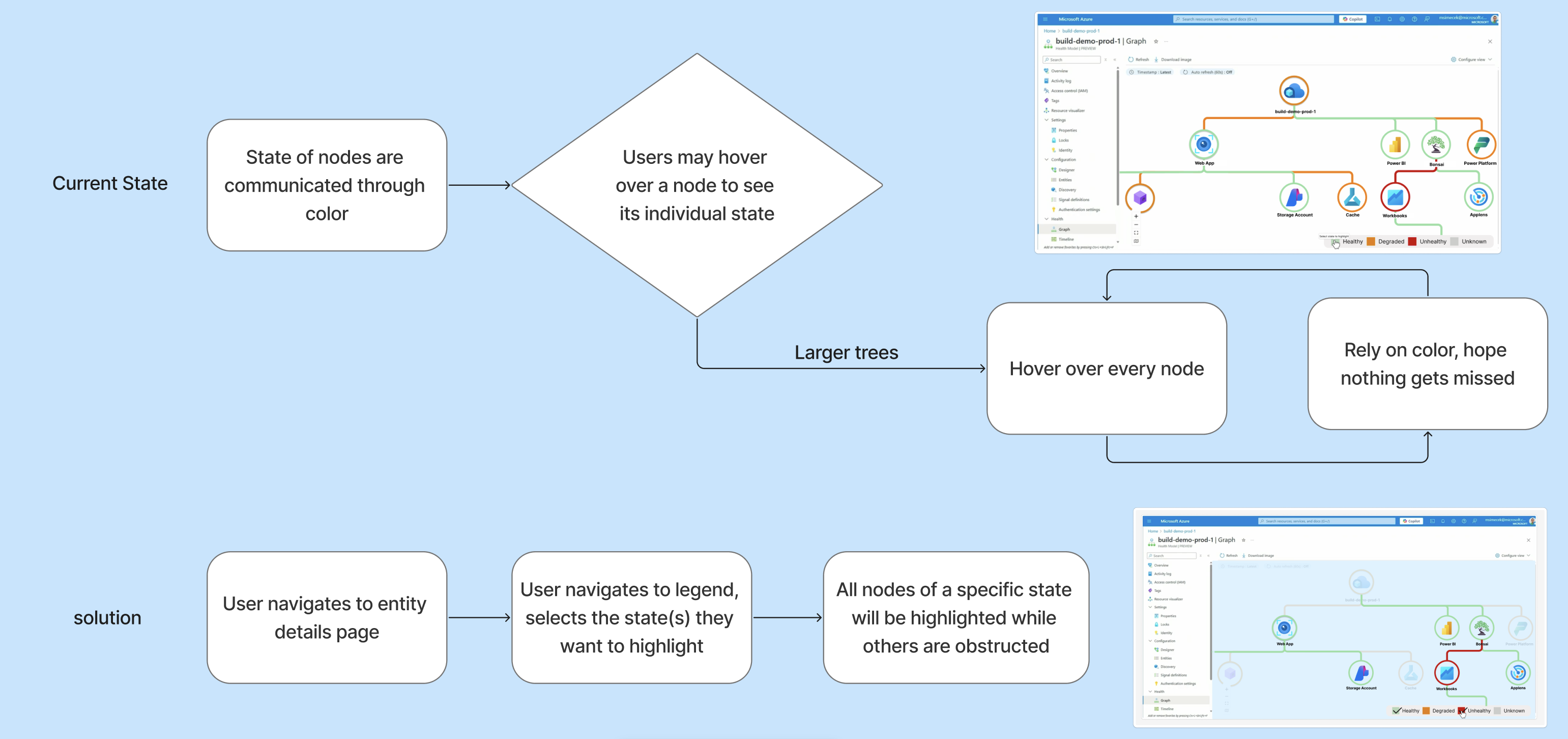
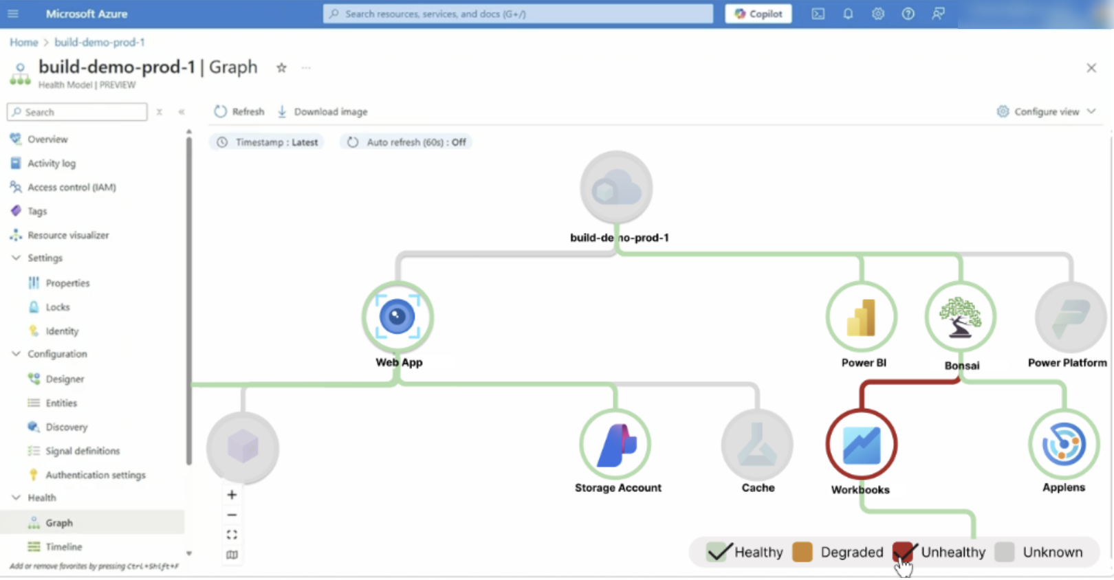
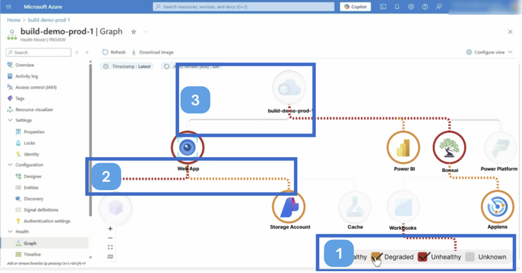
Testing showed animation helps at scale and gives a second cue beyond color. A deselect option stops the animation, and unselected nodes were lightened so they read differently from unknown ones.
Also in the final design: four features built by the team
Together these four features cut the time it takes to find and fix a state change.
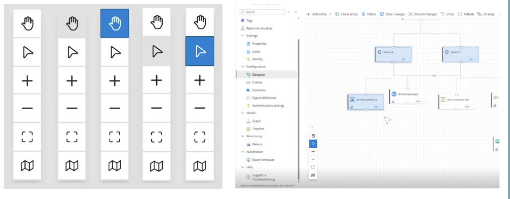
Cursor states in the Designer
Pan and multi-select toggles on the canvas toolbar, so multi-select no longer depends on a hidden shortcut. Selected entities get a blue highlight.
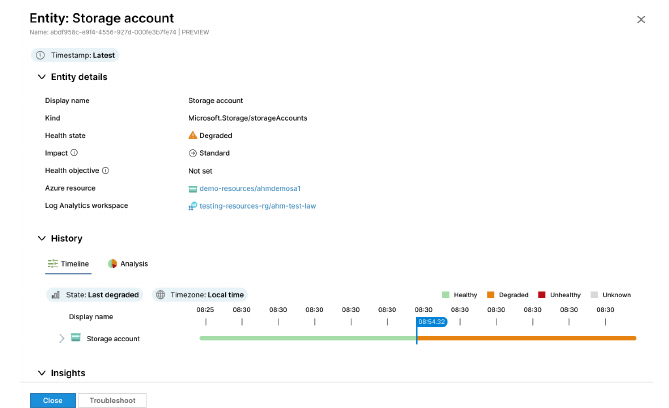
Transition point for state
New State filters center the last state change on the timeline and flag the exact time it happened.
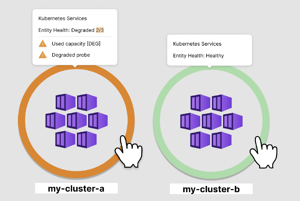
Health tooltip
Hover an entity to see which signals are degraded, such as 2 of 3, so users can prioritize faster.
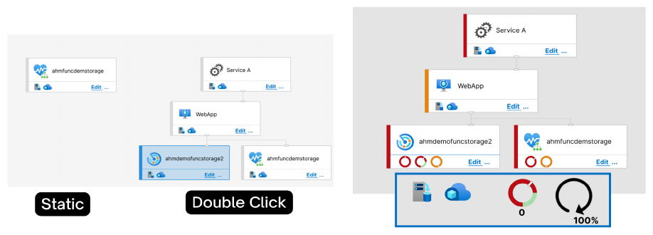
Creating and editing entities
Radial meters count degraded and unhealthy signals inside each entity, and blue marks the selected one, matching Microsoft standards.
How interviews shaped these choices
Each final feature answers something we heard in our two interviews.
Something you would show in a marketing demo.Interview 2, on the health colors
What changed
- For the health tooltip, our documentation notes that Azure is adjusting the way it fetches data to allow the change.
- Testing moved the Threshold Spectrum from a gradient to color blocks, and added animation as a second cue beyond color.
- We delivered design recommendations, prototypes, and a transition document to the Microsoft sponsors.
Design & Accessibility Approach
Prototyped in Figma on top of Microsoft's own interface, so every change looked and behaved like Azure. We checked designs against WCAG 2.1, including non-text contrast, focus visibility, labels, and animation control.
Handed off to Microsoft
- Feasibility research on building each feature.
- Testing at scale with much larger models.
- More user testing with people from different backgrounds.