MIC: CASA Platform Redesign
Redesigning how Court Appointed Special Advocates write court reports and act on flagged case content, so volunteers spend less time on paperwork and more time on the child.
Jump to my workMIC is a cloud-based platform that helps CASA volunteers manage cases and write court reports.
MIC helps Court Appointed Special Advocates (CASAs) handle clerical work, so they can focus on children in CHINS cases: kids who need services because of neglect, abuse, or unsafe situations. CASA volunteers write the court reports that help judges decide what is best for a child.
Our team of nine set out to make report writing and case management faster. I owned user testing and the testing protocol, took the homepage and document page from sketch to final prototype, and organized our process.
How might we reduce the time CASA volunteers spend writing court reports, so they can spend more time advocating for the child?
CASA volunteers
Our primary users. They use MIC daily to track cases and write reports.
Everyone around the case
Judges, case managers, the child, and their families.
What we worked within
- No legal or compliance experts to check AI use.
- Limited firsthand view of the full CASA workflow.
- Testing with a small number of CASA volunteers.
Background
The brief and the timeline
Read moreRead less
Our brief: refine the MIC platform to cut the time volunteers spend on clerical work in report writing and case management.
The final deliverable was a high-fidelity, interactive Figma prototype with two flows, handed to the sponsor. We worked in three milestones: understand the platform, design the user flows, then build the interactive prototype.
From research to prototype
Research to prototype
Click a step to see that stage.
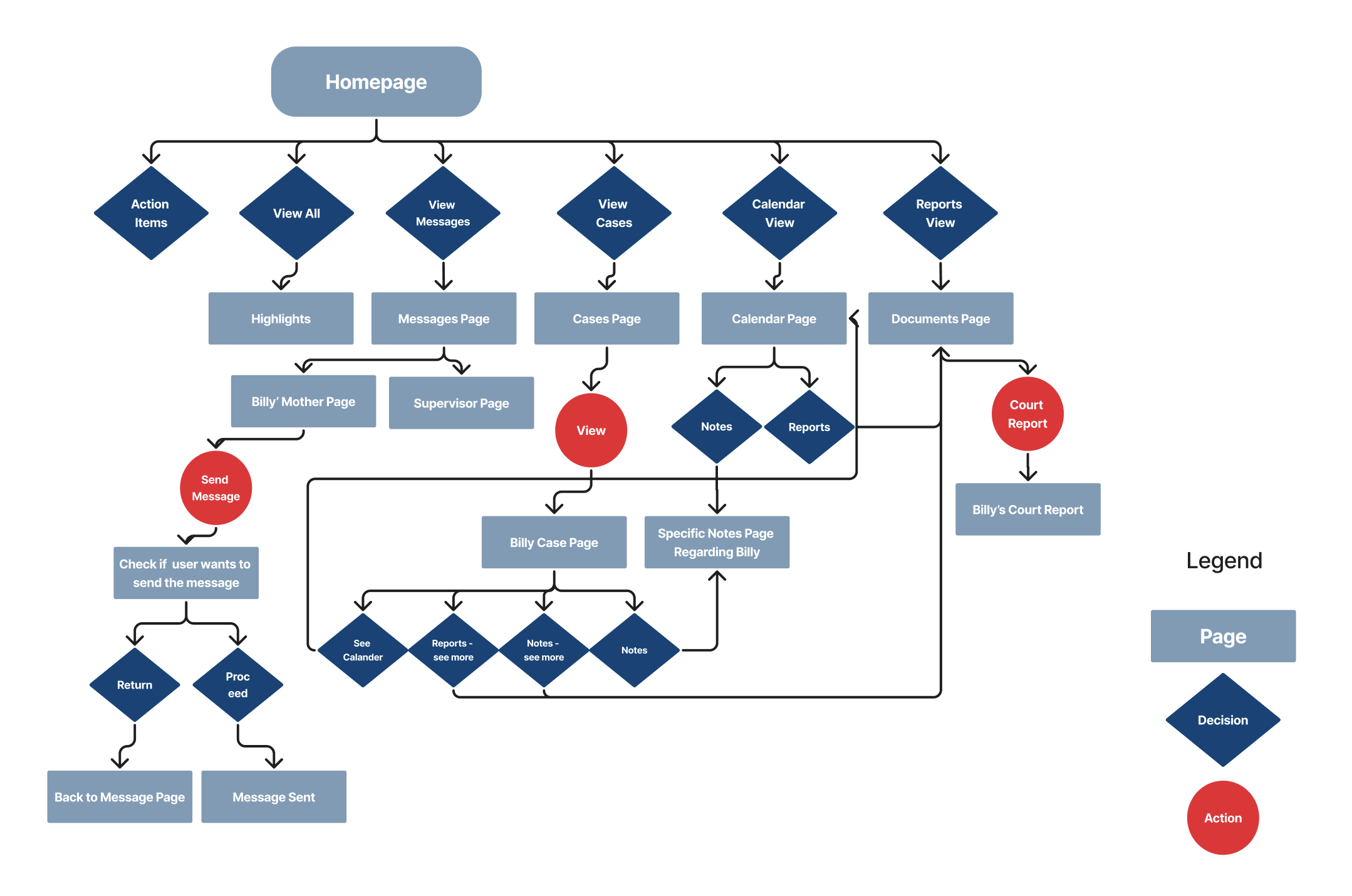
Writing a report took too many clicks.
Cut steps and clutter.
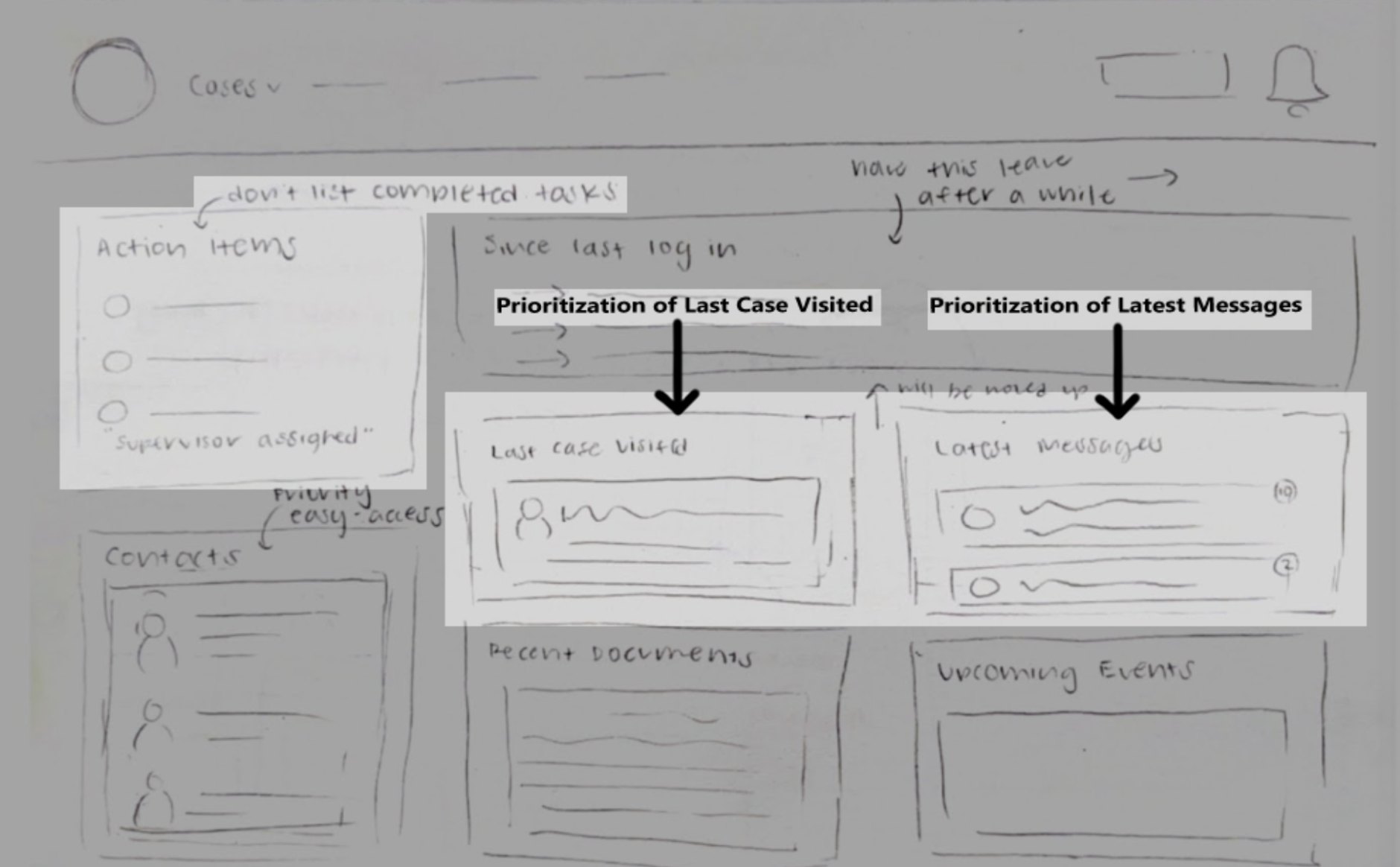
A cluttered dashboard.
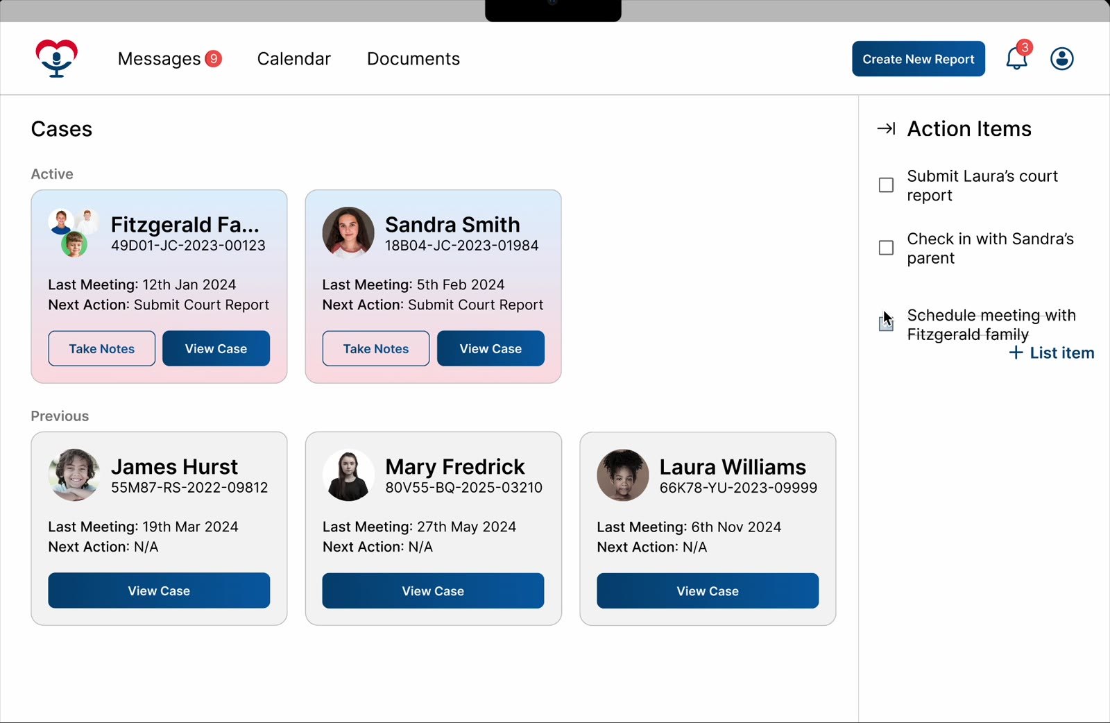
Last case and messages first. Done tasks hidden.
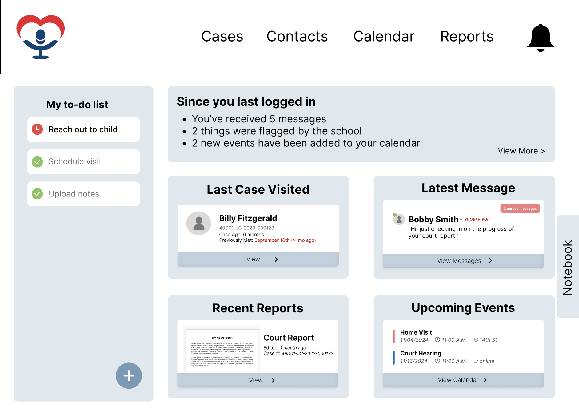
Figma wireframes from my sketches.
Homepage and report page.
Volunteers wanted drafts and more control.
Save as Draft next to Submit.
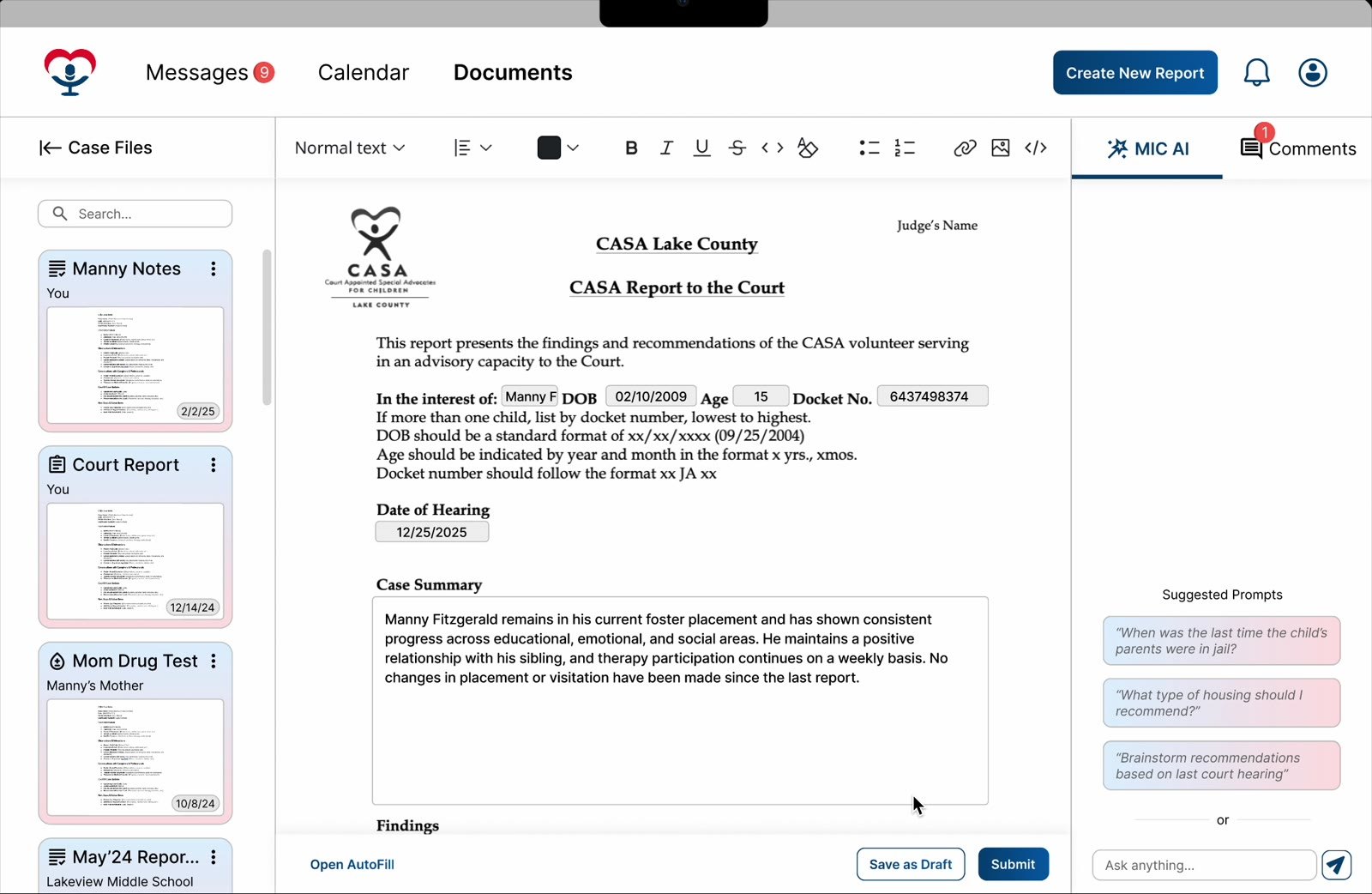
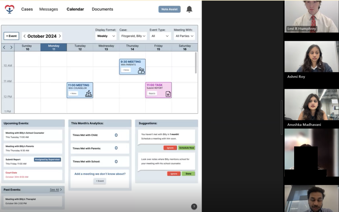
Two interactive flows in Figma.
2 walkthroughs with UX students.
What I owned
- Sketched the homepage and document page, and carried them through wireframes to the final prototype.
- Wrote the usability testing protocol and owned user testing.
- Organized the team's design process and documentation.
- Helped build the interactivity in Figma with my teammates.
Sketching
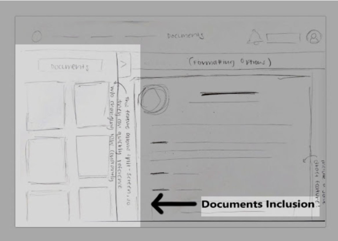
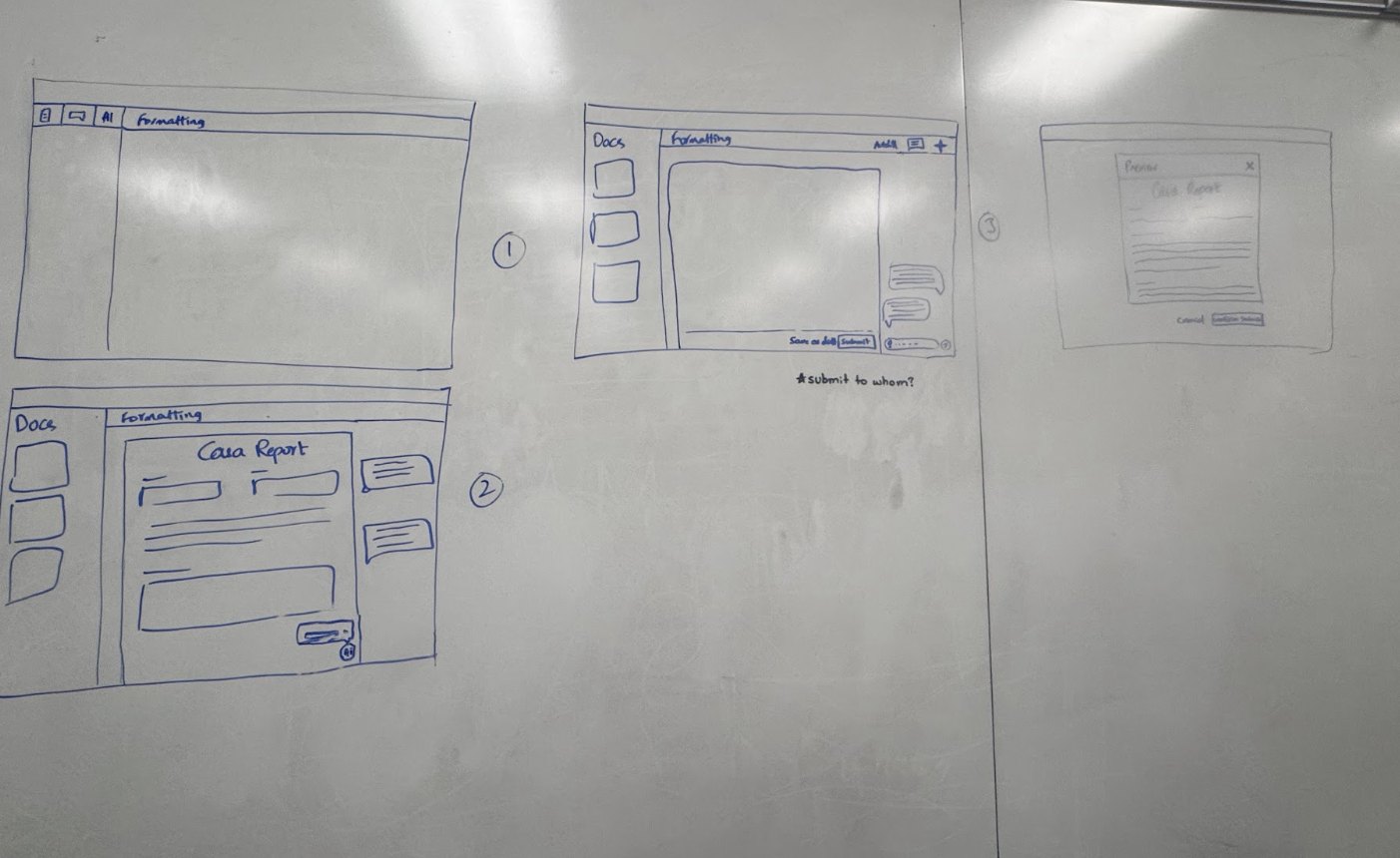
I sketched the homepage and the document page. The team then combined ideas on a whiteboard.
Wireframes
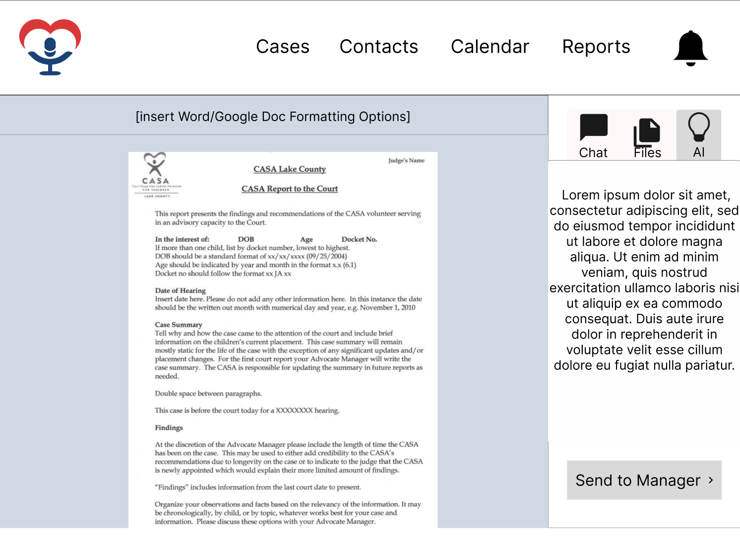
We turned my sketches into wireframes in Figma.
Usability testing
I owned user testing and wrote the protocol.
- 01Up to 30 minutes each
- 023 CASAs, from 6 months to 10 years of experience
- 03Questions for each page, compared with Optima, the system they already use
What we heard
- Voice-to-text and picture uploads were liked. Drafts and privacy settings were wanted.
- Red and green buttons were confusing and hard for colorblind users.
What it changed
- Save as Draft next to Submit.
- Color-only buttons flagged as an accessibility fix.
The final screens
The final homepage and report page grew from my sketches.
Making it interactive
Two interactive flows in Figma. My teammates and I built the interactivity together, and I had a large part in it.
What changed
- Volunteers asked for drafts, so the report page offers Save as Draft next to Submit.
- Red and green buttons confused colorblind volunteers, so color-only buttons were flagged as an accessibility fix.
- Every AI suggestion shows a disclaimer and can be skipped, edited, or confirmed, keeping the volunteer in control.
Design Approach
Prototyped in Figma and mapped in FigJam, with usability heuristics and UX laws in mind. Every AI suggestion shows a disclaimer and can be skipped, edited, or confirmed.
Recommended next
- Create a report from the case view.
- More interactivity, like rearranging cards.
- Onboarding tooltips, and testing with more CASAs.